qplot(models, rename_models=None, figsize=None, ncol=None, nrow=None)
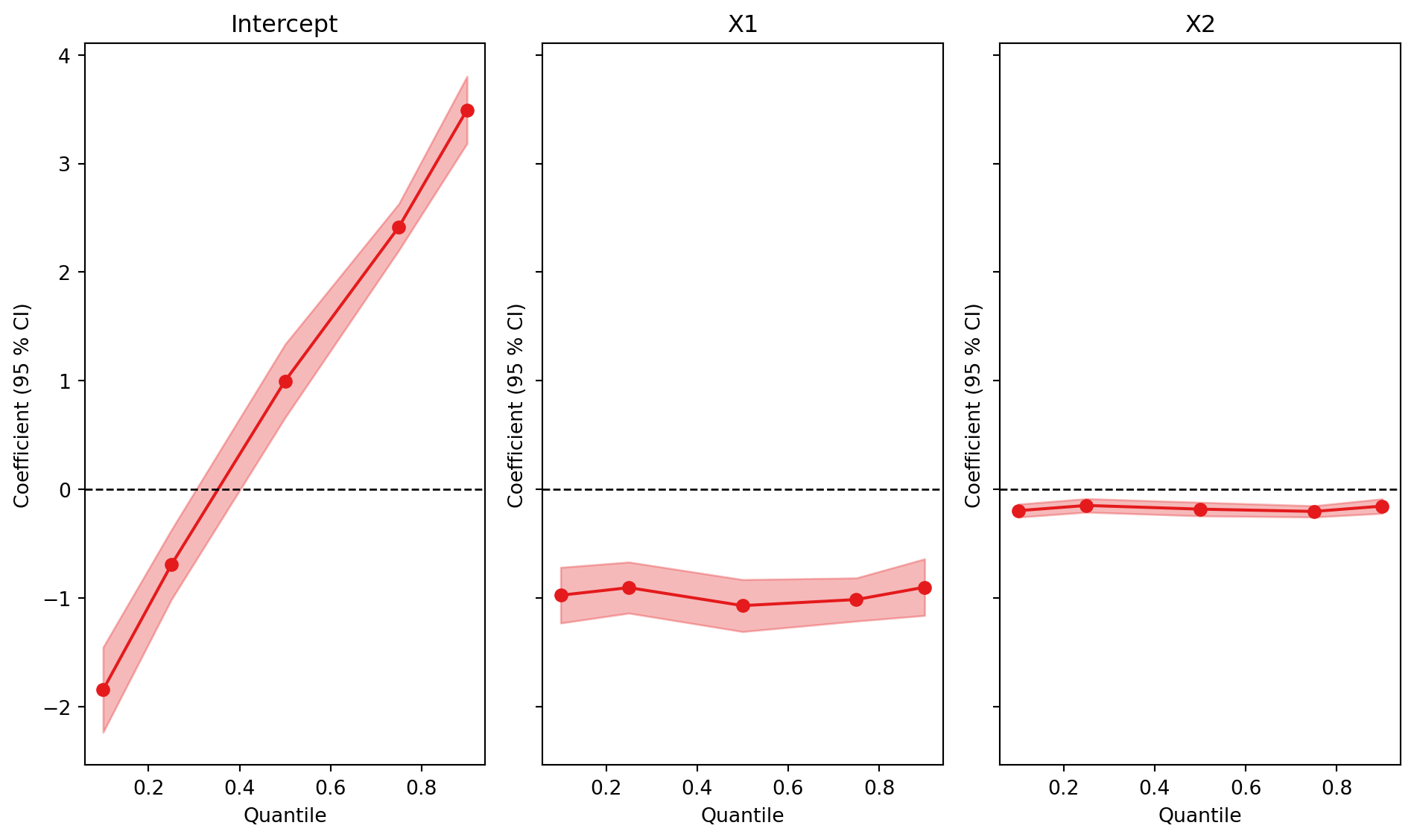
Plot regression quantiles.
Parameters
| models |
Feols, Fepois, Feiv, FixestMulti, or list |
A fitted model object, or a list of Feols, Fepois, and Feiv models. |
required |
| figsize |
tuple or None |
The size of the figure. If None, the default size is (10, 6). |
None |
| rename_models |
dict |
A dictionary to rename the models. The keys are the original model names and the values the new names. |
None |
| ncol |
int |
Number of columns of subplots. Default is None. Note: cannot be set jointly with nrow argument. |
None |
| nrow |
int |
Number of rows of subplots. Default is None. Note: cannot be set jointly with ncol argument. |
None |
Returns
|
object |
A matplotplit figure. |
Examples
Plots the coefficients of a quantile regression across quantiles, the counterpart of coefplot() for quantreg().
import pyfixest as pf

data = pf.get_data()
fit = pf.quantreg("Y ~ X1 + X2", data, quantile=[0.1, 0.25, 0.5, 0.75, 0.9])

pf.qplot(fit)
(<Figure size 960x576 with 3 Axes>,
 array([<Axes: title={'center': 'Intercept'}, xlabel='Quantile', ylabel='Coefficient (95 % CI)'>,
        <Axes: title={'center': 'X1'}, xlabel='Quantile', ylabel='Coefficient (95 % CI)'>,
        <Axes: title={'center': 'X2'}, xlabel='Quantile', ylabel='Coefficient (95 % CI)'>],
       dtype=object))
See the quantile regression tutorial for details.